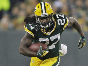
NFL 2010 Best Team Logos and Jerseys
Some are plain, some are ‘cute’ and cartoony, and others downright ugly.
There is a reason most NFL fans prefer their teams’ throwback logos to the usual home kit logo – it is because they are bolder, edgier and usually more creative. It is such an alternate logo that has taken first place this season.
The most popular NFL logos have historically belonged to the Oakland Raiders, Dallas Cowboys, Minnesota Vikings, Pittsburgh Steelers and New England Patriots, but a creative logo that slips under the radar belongs to the Tampa Bay Buccaneers.
In fact, it is their alternate logo that looks best on a helmet. With its ‘Pirates of the Caribbean’ Black Pearl appeal, the Bucs have looked bad in their alternate uni since 1997 – Michael Jackson bad. The skull and swords flag of their first logo is also clever, giving them top spot in that department.
Jerseys are more difficult to judge, as it all come down to colors. The color combination is the only consideration. In this regard, the Cincinnati Bengals (speaking on jersey alone, remember) rank right at the top of the NFL. Though somewhat Haloween-ish, they pull off the popular animal theme the best with their tiger stripes. Simple, and without looking soft or trying to look too tough, the Bengals players can take to take the field every week feeling confident in their ‘skin’.

 SHARE
SHARE TWITTER
 RSS FEED